spot cool stuff HOME
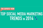
Business is booming at social media marketing agencies. Company budgets for social media marketing are expected to grow by an average of 16% in 2014! And that has marketers clamoring to get ahead of this year’s social media trends so they can figure out how to best spend that budget.
The infographic below gathers together some thoughts on these trends from experts. Among the predictions: mobile will continue to play an increasingly important role; selling through social channels will become the norm. We agree with that. Though, in addition to presenting the infographic’s predictions, Spot Cool Stuff would like to add six of our own:
Continue →

spot cool stuff HOME
How far in advance should you book a vacation to get the best deal?
The content-aggregating website Buzzfeed recently teamed up with analysts at the metasearch travel booking engine Kayak to research that very question. They put their findings in a cool infographic — check it out after the jump.
Continue →

spot cool stuff HOME
Start-up bloggers often ask us whether they should host their own WordPress blog or get a free one through wordpress.com. Below are two infographics that compare those options. But if don’t have time to look them through, we’ll tell you now:
Hosting your own blog is MUCH better than having WordPress do it for you.
There are really only two disadvantages to arranging for your own blog hosting. First, you’ll need to find (and pay for) a good WordPress-friendly website host. Second, you’ll have to do the updates yourself.
Continue →

spot cool stuff HOME
What do your social media and tech habits say about how you travel? Expedia should know. The popular travel booking engine is both technologically savvy and social media active. Based on all that experience, they’ve developed this flow chart you can use to determine what type of traveler you all. See it in the infographic after the jump.
Continue →

spot cool stuff HOME
Spot Cool Stuff has a love of vintage travel guidebooks, the older the better. In one our finds, a guidebook to Afghanistan written in the late 1800s, the authors described the Buddha statues around of the town of Bamiyan as an over-crowded tourist trap. Contrast that with the whole of the last three decades, during which absolutely nowhere in Afghanistan could remotely qualify as an “over-crowded tourist trap.” That, sadly, includes the Bamiyan Buddha statues—they were mostly destroyed by the Taliban in 2001.
The point being: Things change. A place that’s uninviting now might become completely pleasant in the future. A great travel destination now could not be so much later.
Continue →

spot cool stuff HOME
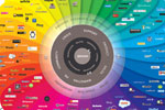
Most of us are not consciously aware of the large extent to which color affects our moods. Green creates a feeling of tranquility. Blue makes you feel productive. Yellow infuses you with energy—and makes babies cry.
The Psychology of Color, a cool infographic produced by NowSourcing, is all about color and its effect on our psyche.
Continue →

spot cool stuff HOME
TRAVEL = HAPPINESS
To some people—and to nearly all devoted readers of the Spot Cool Stuff travel blog—that equation is one of the immutable laws of the universe, as unbendingly true as E=MC2 or I think therefore I am. But for how long has that been true? And what exactly is it about taking a trip that makes us happy? And what can travelers do to prolong that happiness?
Continue →

spot cool stuff HOME
Obviously, the infographic shown below doesn’t depict the lifespan of every TV show (even with the exception of some shows on HBO). My So Called Life only lasted for one season (sadly). The Simpsons has been going for more than 20. Still, it’s amazing how many television series do fit within the basic framework of the lifespan as described in this infographic.
Continue →
spot cool stuff HOME

spot cool stuff HOME
To back up a year’s worth of blog posts by the WordPress community, you would need 2,375 double layer Blu-ray discs.
26% of httparchive’s websites contain errors.
Nearly 7 trillion (!) of online data will be created in the next five years.
58% of the top 10,000 websites use Google Analytics.
Continue →